
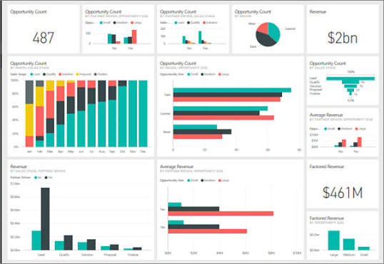
Power BI has become the dominant business intelligence platform for mid-market and enterprise organizations in 2026 — and Microsoft’s AI investments have made it the most AI-integrated BI tool available. From natural language report generation to automated DAX formula writing to smart narrative generation, AI has transformed every aspect of Power BI dashboard creation and analysis.
For Power BI users, the question in 2026 is not whether to use AI — it is which AI tools deliver the most value at each stage of the Power BI workflow: data preparation, data modeling, DAX writing, visualization design, report distribution, and end-user analysis.
This guide covers the best AI tools specifically for Power BI dashboards in 2026 — from Microsoft’s native Copilot to specialized third-party tools that extend Power BI’s native capabilities.
How AI Has Changed Power BI Dashboard Creation
Before AI:
- Write complex DAX measures manually
- Build data models through tedious relationship configuration
- Format visualizations manually — colors, labels, layout
- End users need training to query reports
- Narrative summaries written manually by analysts
After AI:
- Describe metric → AI writes DAX measure
- Natural language data queries from end users
- AI-generated report layouts from business requirements
- Automated narrative summaries that update with data
- Smart anomaly detection without manual monitoring
Best AI Tools for Power BI Dashboards in 2026

Microsoft Native AI Tools
1. Microsoft Copilot in Power BI — Best Overall Power BI AI
Microsoft Copilot is the most transformative AI tool for Power BI — integrated directly into the platform, understanding your data model, and generating complete report pages from natural language descriptions.
Dashboard-specific capabilities:
Report page generation:
“Create a sales performance dashboard showing monthly revenue by region, top 10 products, and salesperson leaderboard with KPI cards for total revenue, units sold, and average order value”
Copilot generates a complete report page with:
- Appropriate visualizations for each request
- Correct measures applied to each visual
- Professional layout and formatting
- Color theme consistent with report
DAX measure generation:
“Write a DAX measure for year-to-date revenue compared to the same period last year, shown as percentage growth”
Copilot writes:
dax
YTD Revenue Growth % =
VAR CurrentYTD = TOTALYTD([Total Revenue], 'Date'[Date])
VAR PriorYTD = CALCULATE(
    TOTALYTD([Total Revenue], 'Date'[Date]),
    SAMEPERIODLASTYEAR('Date'[Date])
)
RETURN
DIVIDE(CurrentYTD - PriorYTD, PriorYTD)
Smart narrative generation:
Copilot automatically generates text summaries explaining dashboard findings:
“Revenue increased 23% YoY driven primarily by the East region (+41%). North region underperformed target by 12%. Top product category (Electronics) grew 35% while Furniture declined 8%.”
Updates automatically as data refreshes — no manual narrative writing.
Q&A visual enhancement:
Copilot improves Power BI’s Q&A feature — better natural language query understanding, more accurate visualization suggestions, and improved synonym recognition.
Summary visual:
New Copilot-powered summary visual automatically identifies and displays the most important findings from any report page — AI-generated executive summary from visual data.
How to access Copilot in Power BI:
- Power BI Premium capacity or Premium Per User license required
- Enable Copilot in the admin portal
- Copilot pane opens in report editing mode
- Available in Power BI Desktop and Power BI Service
Pricing: Power BI Premium Per User: $20/user/month (includes Copilot). Power BI Pro: $10/user/month (no Copilot).
Best for: Every Power BI user — Copilot’s DAX generation and report creation capabilities deliver the highest ROI of any Power BI AI investment.
2. Power BI Q&A — Best for End-User Natural Language Queries
Power BI’s Q&A feature allows dashboard end users to query data in plain English — no DAX knowledge required.
Dashboard-specific capabilities:
Natural language queries:
End users type questions directly in the dashboard:
- “Show me sales by region for last quarter”
- “Which product had the highest profit margin in 2025?”
- “Compare revenue this year vs last year by month”
Q&A generates an appropriate visualization from the question.
Q&A visual embedding:
Add Q&A visual to any report page → end users ask questions → Power BI answers with chart/table.
AI improvements in 2026:
- Better synonym handling — “revenue,” “sales,” “income” all recognized as the same measure
- Context awareness — remembers previous questions in session
- Suggested questions — AI proposes relevant questions based on the data model
- Copilot-enhanced understanding — more complex questions handled accurately
Linguistic schema optimization:
Define synonyms, phrasings, and relationships in linguistic schema → Q&A becomes more accurate for your specific business terminology.
Best for: Power BI dashboards used by non-technical business users — Q&A empowers anyone to get data answers without analyst intervention.
3. Power BI Key Influencers Visual — Best for AI Insight Discovery
Key Influencers is Power BI’s built-in AI visual — automatically identifies which factors most strongly influence any metric.
Dashboard use cases:
Customer churn analysis:
Add Key Influencers → drag churn rate as analyzed metric → drag potential factors (tenure, product type, support tickets, region) → AI identifies which factors most predict churn with statistical significance.
Sales performance analysis:
“What factors most influence whether a deal closes?”
→ Key Influencers shows: deal size, number of touchpoints, time in pipeline, decision maker engagement — ranked by influence strength.
Product quality analysis:
“What drives high return rates?”
→ AI identifies: specific SKUs, regional patterns, seasonal factors, price points.
How to add to Power BI dashboard:
Visualizations pane → Key Influencers visual → drag metric and potential factors → AI analyzes automatically.
Best for: Executive dashboards where understanding drivers matters more than just reporting numbers — Key Influencers adds diagnostic capability to any Power BI report.
4. Power BI Decomposition Tree — Best for AI Root Cause Analysis
Decomposition Tree lets users explore data hierarchies dynamically — AI suggests the most interesting next level to explore.
Dashboard use cases:
Revenue analysis:
Start with total revenue → AI suggests splitting by region → then by product category → then by salesperson → drill to the exact combination causing variance.
AI splits:
“High value” AI split — AI identifies which dimension explains most variance at each level → guides analysis to most meaningful insights automatically.
Budget variance investigation:
“Where is the budget variance coming from?”
→ Decomposition Tree with AI splits identifies: Southeast region → Q3 → specific product line → two underperforming salespeople → root cause found in minutes.
How to add:
Visualizations → Decomposition Tree → add Analyze field (metric) and Explain by fields (dimensions) → AI splits button appears.
Best for: Finance and operations dashboards where root cause analysis is frequent — Decomposition Tree AI eliminates manual drill-down investigation.
5. Power BI Anomaly Detection — Best for Automated Monitoring

Power BI’s built-in anomaly detection uses AI to automatically identify unusual patterns in time-series data — no manual threshold setting required.
Dashboard use cases:
Sales anomaly detection:
Add anomaly detection to revenue line chart → AI learns normal patterns → automatically flags unusual spikes or drops with an explanation.
Website traffic monitoring:
Add to daily sessions chart → AI detects traffic anomalies → hover over anomaly marker → explanation: “Sessions 43% below expected based on historical patterns for this day of the week.”
Inventory monitoring:
Flag unexpected inventory movements → investigate specific SKUs → catch data entry errors or genuine supply chain issues early.
Configuration:
Select line chart → Analytics pane → Find anomalies → Enable → configure sensitivity.
Best for: Operational dashboards that require continuous monitoring — anomaly detection replaces manual watching with automated AI surveillance.
Third-Party AI Tools for Power BI
6. SQLBI DAX Studio with AI Features — Best for DAX Development
DAX Studio is the essential free tool for Power BI DAX development — and its AI-enhanced features in 2026 significantly accelerate DAX formula writing and optimization.
Power BI AI capabilities:
DAX formula completion:
AI autocomplete for DAX functions — suggests completions, parameter values, and common patterns as you type.
Query optimization:
Analyze slow DAX measures → AI identifies optimization opportunities:
- Replace CALCULATE with SUMX where appropriate
- Add variables (VAR) for repeated calculations
- Identify filter context issues
- Suggest REMOVEFILTERS vs ALL vs ALLEXCEPT
VertiPaq Analyzer:
Analyze Power BI data model size → AI identifies largest tables, columns, and cardinality issues → actionable recommendations for model optimization.
Pricing: DAX Studio is completely free — open source.
Best for: Power BI developers who write complex DAX — DAX Studio’s optimization suggestions reduce measure execution time by 30–70% in many cases.
7. Acterys AI — Best for Power BI Financial Planning

Acterys extends Power BI with AI-powered financial planning, budgeting, and forecasting — transforming static Power BI reports into interactive planning tools.
Power BI AI capabilities:
AI forecasting:
Add Acterys forecasting to any Power BI metric → AI generates forward projections based on historical patterns and seasonal adjustments → displayed as a Power BI visual.
What-if analysis:
Adjust assumptions directly in Power BI dashboard → AI recalculates financial model → instant scenario visualization.
Write-back functionality:
Enter budget and plan data directly in Power BI → data written back to database → reports update immediately.
Best for: Finance teams using Power BI for FP&A — Acterys bridges the gap between BI reporting and financial planning in one Power BI environment.
8. ChatGPT / Claude — Best for Power BI DAX Generation
General AI assistants are surprisingly effective for Power BI DAX formula generation — describe the measure, get working DAX code.
Power BI-specific prompts:
Complex DAX generation:
“Write a Power BI DAX measure for:
- Rolling 3-month average of [Sales Amount]
- Filtered to current region context
- Compared against rolling 3-month average from same period last year
- Shown as percentage difference”
M code for Power Query:
“Write Power Query M code to:
- Import multiple Excel files from SharePoint folder
- Combine all sheets named ‘Monthly Sales’
- Add a calculated column for gross margin percentage
- Filter to current year data only”
DAX debugging:
Paste broken DAX measure → “Find the error in this DAX measure and explain the fix:
[paste your broken DAX]..”
Data model design:
“Design a star schema for a Power BI model tracking: orders, products, customers, salespeople, dates, and targets. What tables, relationships, and calculated columns do I need?”
Free plan: ChatGPT free and Claude free both handle Power BI DAX questions effectively.
Best for: Power BI developers who need on-demand DAX expertise — AI assistants provide measure logic, debugging, and optimization advice at any hour.
9. Zebra BI for Power BI — Best for Financial Reporting Dashboards
Zebra BI extends Power BI’s visualization library with IBCS-compliant financial charts — AI-assisted formatting for professional financial dashboards.
Power BI financial dashboard capabilities: IBCS-compliant
IBCS-compliant charts:
International Business Communication Standards formatting — used by professional finance teams globally for consistent, unambiguous data presentation.
Waterfall charts:
Professional variance analysis charts — actual vs budget vs prior year with proper positive/negative formatting.
Small multiples:
Trellis charts comparing multiple entities simultaneously — automated layout optimization.
AI formatting:
Automatically applies IBCS color conventions and formatting rules — no manual formatting required for professional output.
Pricing: Free plan (limited). Pro from $17.50/user/month.
Best for: Finance and management reporting Power BI dashboards where professional, standardized formatting is required.
10. Power BI Paginated Reports with AI — Best for Pixel-Perfect Reports
Power BI Paginated Reports combined with AI assistance generateprint-ready, pixel-perfect reports from Power BI data models.
AI capabilities:
Report Builder with Copilot:
Copilot generates paginated report layouts from natural language descriptions; tables, groups, totals, and formatting are applied automatically.
Expression generation:
AI writes complex SSRS/RDL expressions for conditional formatting, calculated fields, and dynamic text.
Best for: Organizations needing print-ready invoices, financial statements, and regulatory reports alongside interactive Power BI dashboards.
Power BI AI Dashboard Workflow — End-to-End
Phase 1 — Data Preparation (Power Query + AI)
Without AI (manual):
Build M code transformations step by step — 2–4 hours for complex data prep.
With AI:
Describe the transformation in ChatGPT → get M code → paste in Power Query Advanced Editor → test → done in 30 minutes.
Key Power Query AI prompts:
- “Clean and standardize this dataset: remove duplicates, fill blanks with previous value, split address column into street/city/state/postcode”
- “Combine 12 monthly Excel files, add month column from filename, calculate running total”
Phase 2 — Data Modeling (AI-Assisted)
With Copilot / ChatGPT:
- Generate calculated columns: “Write DAX calculated column for customer age bucket: Under 25, 25-40, 40-55, Over 55”
- Create measure table structure: AI suggests an organized measure table layout
- Relationship design: Describe data → AI suggests star schema structure
Phase 3 — DAX Measure Writing (Copilot + AI Assistants)
Most common AI-generated DAX measures for dashboards:
YTD with comparison:
dax
Sales YTD vs PYTD =
DIVIDE(
    TOTALYTD([Total Sales], 'Date'[Date]),
    TOTALYTD([Total Sales], SAMEPERIODLASTYEAR('Date'[Date]))
) - 1
Running total:
dax
Running Total =
CALCULATE(
    [Total Sales],
    FILTER(
        ALLSELECTED('Date'),
        'Date'[Date] <= MAX('Date'[Date])
    )
)
Ranking:
dax
Product Rank =
RANKX(
    ALLSELECTED('Product'[Product Name]),
    [Total Sales],
    ,
    DESC,
    DENSE
)
Phase 4 — Visualization and Layout (Copilot)
Copilot report generation:
“Create a one-page executive summary dashboard with:
- 4 KPI cards: Revenue, Margin %, Orders, Avg Order Value
- Monthly trend line chart
- Top 5 products bar chart
- Regional map visualization
- YoY comparison table”
Copilot generates complete page layout in seconds.
Phase 5 — AI Insights and Distribution
Smart narratives: Copilot generates automated text summaries
Anomaly detection: Enabled on key time-series metrics
Key influencers: Added to root cause analysis pages
Q&A visual: Added to self-service pages for end users
Scheduled reports: Power Automate + AI to distribute personalized reports
Power BI Dashboard AI — By User Role
Power BI Developer
- DAX: ChatGPT/Claude free + Copilot (paid)
- M code: ChatGPT for complex transformations
- Optimization: DAX Studio (free) for performance
- Testing: AI-assisted test case generation
Business Analyst
- Report creation: Copilot page generation
- DAX: Copilot quick measures
- Insights: Key Influencers, Decomposition Tree
- Ad-hoc: Q&A visual for self-service
End User
- Q&A: Natural language queries
- Smart narrative: AI-generated summaries
- Anomaly alerts: Automated monitoring
- Mobile: AI-optimized mobile layouts
IT/Admin
- Gateway: AI-assisted configuration
- Performance: Copilot optimization suggestions
- Security: AI-generated row-level security DAX
Power BI Copilot vs ChatGPT for DAX — Comparison
| Capability | Power BI Copilot | ChatGPT/Claude |
|---|---|---|
| Context awareness | ✅ Knows your model | ❌ You describe model |
| DAX accuracy | ✅ Higher (model context) | ⚠️ Good but may need adjustment |
| Cost | $20/user/month | Free |
| Report generation | ✅ Yes | ❌ No |
| Smart narratives | ✅ Yes | ❌ No |
| Q&A enhancement | ✅ Yes | ❌ No |
| Complex logic | ✅ Strong | ✅ Strong |
| Debugging | ✅ With context | ✅ Good |
Recommendation: Use both. ChatGPT/Claude free for DAX logic design and debugging — Copilot for report generation and in-Power BI workflow where model context matters.
Free vs Paid Power BI AI Tools
Completely Free
- ChatGPT/Claude — DAX generation, M code, design advice
- Power BI Q&A — built into Power BI free
- Key Influencers visual — built into Power BI free
- Decomposition Tree — built into Power BI free
- DAX Studio — open source, free
- Power BI Desktop — free download
Paid (Worth Considering)
- Copilot in Power BI — $20/user/month (Premium Per User)
- Zebra BI Pro — $17.50/user/month
- Acterys — varies by plan
Free Trial Available
- All Copilot features — 60-day Power BI Premium trial
- Zebra BI — 14-day free trial
Frequently Asked Questions
Which AI tool is best for Power BI dashboards in 2026?
Microsoft Copilot in Power BI is the best overall — direct integration, model-aware DAX generation, report page creation, and smart narratives deliver the most value. For users without a Copilot subscription, ChatGPT/Claude free for DAX generation combined with Power BI’s native AI visuals (Key Influencers, Q&A, Decomposition Tree) covers most needs for free.
Can I use ChatGPT to write Power BI DAX measures?
Yes — ChatGPT and Claude both write effective DAX measures from plain language descriptions. Describe your measure requirement, specify your table and column names, and AI generates working DAX. Always test generated DAX — occasional syntax errors need manual correction.
Does Power BI Copilot require an expensive license?
Power BI Copilot requires a Premium Per User license at $20/user/month — more expensive than Pro ($10/user/month). For small teams, the Copilot productivity gain typically justifies the cost. Microsoft offers a 60-day Premium trial — test Copilot value before committing.
Which free Power BI AI tool delivers most value?
Power BI’s built-in AI visuals (Key Influencers, Decomposition Tree, Anomaly Detection, Q&A) are completely free and deliver genuine analytical value. Combined with ChatGPT/Claude free for DAX generation, these free tools cover the majority of Power BI AI use cases without any paid subscription.
How do I get Copilot in Power BI?
Admin portal → Copilot settings → enable. Requires Power BI Premium capacity or a Premium Per User license. Once enabled, the Copilot pane appears in Power BI Desktop and Power BI Service report editing mode.
Conclusion
AI has made Power BI dashboards faster to build, easier to use, and more analytically powerful than at any previous point. The tools span from completely free built-in features to premium Copilot capabilities.
Start free: Enable Q&A, Key Influencers, Decomposition Tree, and Anomaly Detection — all built into Power BI at no extra cost. Use ChatGPT free for DAX generation and DAX Studio for optimization.
Upgrade to Copilot when: Report creation time is a bottleneck, end users need AI-generated summaries, or DAX complexity requires model-aware generation. The $20/user/month pays for itself quickly in analyst time saved.
Specialized needs: Zebra BI for financial reporting standards, Acterys for planning and forecasting, Paginated Reports for pixel-perfect output.
The most impactful immediate action: enable Q&A visual on your most-used Power BI dashboard — add it today, train your model’s linguistic schema this week, and watch business users get answers independently instead of creating analyst requests.

