
Dashboard design sits at the intersection of data visualization, user interface design, and business intelligence — and it has historically required expertise in all three disciplines simultaneously. A well-designed dashboard communicates complex data instantly. A poorly designed one confuses even the people who built it.
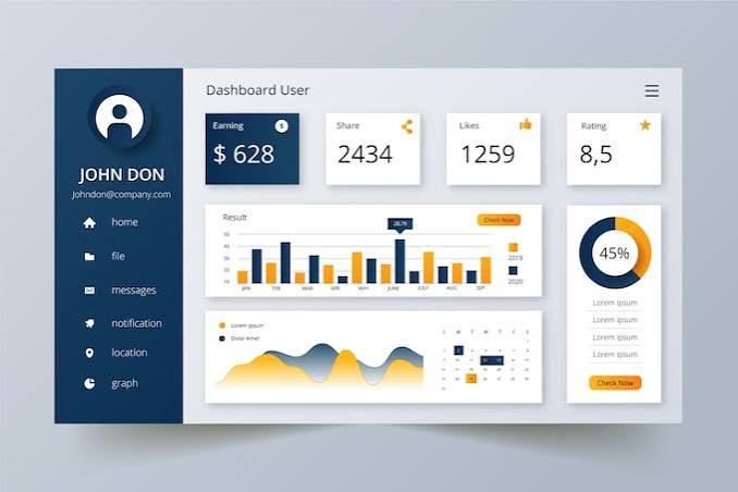
In 2026, AI tools have transformed dashboard design in two fundamental ways: they have made it possible for non-designers to create professional-quality dashboards, and they have made professional designers significantly faster and more capable.
Whether you are building a sales performance dashboard, a marketing analytics interface, a financial reporting tool, or a real-time operations monitor, this guide covers the best AI tools for dashboard design in 2026 — evaluated on design quality, AI assistance depth, and real-world usability.
- Check out Actical. Best AI Tools for Data Analysis in 2026
What Makes Dashboard Design Different from General Design
Dashboard design has specific requirements that general design tools do not always handle well:
Data binding — Dashboard elements must connect to live or updated data sources. A chart is not useful if it cannot update automatically.
Information hierarchy — The most important metric must be visually dominant. Secondary information must be accessible but not competing for attention.
Responsiveness — Dashboards are viewed on large monitors, laptops, tablets, and phones — all with different screen dimensions.
Interactivity — Filters, drill-downs, tooltips, and date range selectors are standard dashboard features that static design tools cannot replicate.
Color for data — Dashboard color choices must support data differentiation — not just aesthetic preference. Color-blind users must be considered.
Performance — Dashboards with many data visualizations must load fast and update in real time.
Best AI Tools for Dashboard Design in 2026
Full Dashboard Building Platforms
1. Tableau with Einstein AI — Best for Professional Dashboard Design

Tableau remains the gold standard for professional dashboard design — and Einstein AI makes its already powerful visualization engine significantly more accessible to non-designers.
AI design features:
- Ask Data — describe the dashboard you want in plain language; Einstein generates it
- Explain Data — AI explains why specific metrics changed, adds context to visualizations
- Auto-generated insights — AI identifies the most important trends to highlight in the dashboard
- Smart layout suggestions — AI recommends optimal placement of charts based on data relationships
- Color recommendation — AI suggests color palettes appropriate for data type and quantity
- Dashboard accessibility checker — AI flags color contrast and readability issues
Dashboard design strengths:
- Drag-and-drop layout with AI-assisted placement
- 30+ chart types with automatic type recommendation
- Responsive design preview across device sizes
- Custom CSS for pixel-perfect branding
- Template library for common dashboard types (executive, operational, financial)
Pricing: Creator license from $75/user/month. Viewer license from $15/user/month. Free trial available.
Best for: Enterprise BI teams and professional dashboard designers who need the most powerful combination of AI assistance and design control — Tableau’s output quality is unmatched for complex, multi-source dashboards.
2. Power BI with Copilot — Best for Microsoft Ecosystem Dashboards

Microsoft Power BI with Copilot integration is the strongest AI-powered dashboard tool for organizations already using Microsoft 365 — its natural language dashboard generation is the most intuitive available.
AI design features:
- Copilot dashboard generation — describe a dashboard in plain language; Copilot builds a complete layout
- Narrative generation — AI writes text summaries explaining dashboard findings
- Q&A visual — embed a natural language query box in your dashboard for end users
- Quick measures — AI generates complex DAX formulas from plain language descriptions
- Smart narratives — automatically updates text explanations as data changes
- Theme designer — AI generates color themes from brand colors or reference images
Dashboard design strengths:
- Native Microsoft ecosystem integration — Excel, SharePoint, Teams
- Mobile-optimized layout designer
- Custom visuals marketplace — hundreds of additional chart types
- Row-level security for user-specific dashboard views
- Embedded analytics — publish dashboards to any website or app
Pricing: Power BI Pro from $10/user/month. Premium from $20/user/month.
Best for: Businesses and analysts already in the Microsoft 365 ecosystem — Power BI’s Copilot makes dashboard creation as simple as describing what you want.
3. Looker Studio (Google) — Best Free AI Dashboard Tool

Google’s Looker Studio provides free dashboard creation with AI-assisted insights — the strongest free option for Indian businesses and individuals building analytics dashboards.
AI design features:
- Automatic chart type recommendation based on data
- AI-generated insight summaries
- Smart date range suggestions
- Anomaly detection and highlighting
- Auto-generated dashboard templates from data source
Dashboard design strengths:
- Completely free — no cost for most features
- Native Google data source connections — Analytics, Ads, Search Console, Sheets
- BigQuery integration for large dataset dashboards
- Collaborative editing — multiple designers simultaneously
- Scheduled email delivery of dashboard snapshots
- Embedded dashboard sharing
Pricing: Completely free. Looker Studio Pro from $9/user/month for enterprise features.
Best for: Indian digital businesses, marketers, and analysts who want professional dashboards at zero cost — particularly strong for Google Analytics and Google Ads performance dashboards.
4. Retool with AI — Best for Custom Interactive Dashboards
Retool is the leading low-code platform for building custom internal dashboards and tools — its AI features dramatically accelerate the development of complex, interactive dashboard applications.
AI design features:
- AI component generation — describe a UI component in plain language, and Retool builds it
- AI query generation — describe data you need, AI writes SQL or API query
- Layout suggestions — AI recommends optimal component arrangement
- Auto-complete for queries — AI completes database queries as you type
- Natural language to dashboard — describe entire dashboard, AI generates structure
Dashboard design strengths:
- Pre-built 100+ UI components — tables, charts, forms, maps
- Direct database connection — PostgreSQL, MySQL, MongoDB, Supabase
- REST API and GraphQL integration
- JavaScript customization for complex logic
- Role-based access control per dashboard section
- Real-time data updates via WebSocket
Pricing: Free plan (5 apps, limited features). Team from $10/user/month. Business from $50/user/month.
Best for: Technical teams building custom internal dashboards connected to databases and APIs — Retool with AI is the fastest way to build database-connected dashboards without full custom development.
Design and Prototyping Tools
5. Figma with AI Plugins — Best for Dashboard UI/UX Design
Figma is the most widely used interface design tool globally — and its AI plugins make dashboard UI/UX design significantly faster, particularly for creating dashboard prototypes before connecting real data.
AI design features:
- Figma AI — generates UI components from text descriptions
- Magician plugin — AI generates icons, images, and copy for dashboard elements
- Automator plugin — AI automates repetitive design tasks across dashboard frames
- Relume plugin — AI generates complete dashboard wireframes from descriptions
- Chart plugin with AI — generates realistic chart data for dashboard mockups
Dashboard design workflow:
- Describe dashboard layout in Figma AI
- AI generates wireframe structure
- Populate with AI-generated realistic chart mockups
- Apply design system for visual consistency
- Prototype interactions — drill-downs, filter changes
- Hand off to developers with exact specs
Pricing: Free plan (3 projects). Professional from $12/editor/month. Organization from $45/editor/month.
Best for: UI/UX designers creating dashboard prototypes and design systems — Figma is the standard for dashboard design mockups before development.
6. Framer with AI — Best for Interactive Dashboard Prototypes
Framer combines design and code — allowing dashboard designers to create fully interactive prototypes that look and function like real dashboards.
AI design features:
- Framer AI — generates complete page layouts from text descriptions
- AI copywriting for dashboard labels and descriptions
- AI image generation for dashboard backgrounds and icons
- Component generation from natural language
Dashboard design strengths:
- Real interactions — hover states, click events, animations
- Responsive design built in
- Publish to live URL — share working prototype with stakeholders
- React component integration for code-backed interactions
Pricing: Free plan (limited pages). Mini from $5/month. Basic from $15/month.
Best for: Dashboard designers who need high-fidelity interactive prototypes for stakeholder review — Framer prototypes are indistinguishable from real products.
Data Visualization Specific Tools
7. Visme with AI — Best for Infographic-Style Dashboards
Visme specializes in visually rich data presentations — combining dashboard design with infographic capability for the most visually engaging data communication.
AI design features:
- AI Document Generator — creates complete dashboard layouts from data descriptions
- Smart charts — AI selects optimal chart type for your data automatically
- AI writer — generates dashboard labels, titles, and insight text
- Color palette AI — generates branded color schemes
- Animation designer — AI suggests appropriate motion for data reveals
Dashboard design strengths:
- Data-driven animations — numbers count up on load
- Interactive elements — clickable filters, expandable sections
- Map visualizations — geographic data dashboards
- Brand kit — consistent visual identity across dashboard elements
- Export to PDF for static report versions
Pricing: Free plan (5 projects). Starter from $12.25/month. Pro from $24.75/month.
Best for: Marketing teams and consultants who need visually impressive dashboards for client presentations — Visme’s design quality exceeds standard BI tool output.
8. Flourish — Best for Animated and Storytelling Dashboards
Flourish is a data visualization platform specifically built for creating animated, story-driven dashboards that communicate data narratives rather than just displaying numbers.
AI design features:
- AI chart type recommendation
- Automated animation between data states
- Color accessibility checker
- Template intelligence — AI suggests templates based on data structure
Dashboard design strengths:
- 100+ visualization templates — race charts, network diagrams, scrollytelling
- Animated data stories — data changes visible over time
- Embed anywhere — any website, Notion, Medium
- Real-time data connection via Google Sheets
- No coding required for animations
Pricing: Free plan (public projects). Business from $99/month.
Best for: Journalists, analysts, and marketers who want animated, story-driven data dashboards — Flourish creates dashboards that audiences actually want to explore.
9. Observable with AI — Best for Code-Based Dashboard Design
Observable is a notebook-based platform for creating data visualizations and dashboards using JavaScript — its AI features make code-based dashboard creation accessible to analysts without deep programming experience.
AI design features:
- AI code completion for D3.js and Observable Plot
- Natural language to visualization — describe a chart, AI generates code
- AI explains existing visualization code
- Automatic formatting and linting
Dashboard design strengths:
- Full D3.js and Observable Plot capability — unlimited customization
- Reactive programming model — update one element, everything connected updates
- Collaborative notebooks — team edits simultaneously
- Version control built in
- Publish to public or private URLs
Pricing: Free plan (public notebooks). Pro from $14/month. Enterprise pricing available.
Best for: Data scientists and developers who want complete custom control over dashboard design using code — Observable with AI bridges the gap between full coding and no-code tools.
AI Tools for Specific Dashboard Types
10. Klipfolio with AI — Best for Marketing Dashboards
Klipfolio is specifically designed for marketing and business metrics dashboards — connecting to 100+ marketing tools with AI-assisted dashboard building.
Data connections: Google Analytics, Facebook Ads, Google Ads, HubSpot, Salesforce, Shopify, and 100+ more.
AI features:
- Automatic metric suggestions based on connected data sources
- AI dashboard templates for common marketing use cases
- Smart alerts — AI notifies when metrics deviate from expected patterns
- Natural language metric builder
Pricing: Grow from $90/month. Team from $200/month.
Best for: Marketing agencies and teams who need dashboards combining data from multiple marketing platforms — Klipfolio’s 100+ integrations cover the entire marketing stack.
11. Grafana with AI — Best for Technical/DevOps Dashboards
Grafana is the most widely used open-source dashboard tool for technical monitoring — and its AI features in 2026 make operational dashboard design accessible to non-developers.
AI features:
- Grafana ML — machine learning-based anomaly detection in dashboards
- Natural language panel builder — describe the metric you want to display; AI generates a panel
- Alert intelligence — AI reduces alert noise by clustering related notifications
- Predictive visualizations — forecast future metric values based on historical patterns
Dashboard design strengths:
- 80+ data source plugins — Prometheus, InfluxDB, Elasticsearch, MySQL, and more
- Real-time streaming data — sub-second update rates
- Alert management — visual and notification alerts from dashboard
- Templating — variables that make one dashboard serve multiple environments
- Kubernetes, AWS, and Azure monitoring built-in templates
Pricing: Open source (free, self-hosted). Cloud from $8/month. Enterprise pricing available.
Best for: DevOps teams, SREs, and technical teams building infrastructure monitoring and application performance dashboards.
Dashboard Color and Typography AI Tools
12. Coolors (Free) — Best for Dashboard Color Palette
Dashboard color choices directly affect data comprehension — Coolors generates data-appropriate color palettes faster than any other free tool.
For dashboards specifically:
- Generate 5-color sequential palettes for choropleth maps
- Categorical palettes for distinguishing multiple data series
- Diverging palettes for positive/negative data
- Export hex codes directly into any dashboard tool
- Accessibility check — verify sufficient contrast for all color combinations
Pricing: Core palette generation completely free.
13. Contrast (Free) — Best for Dashboard Accessibility
Dashboard accessibility is non-negotiable for professional design — Contrast checks color combinations against WCAG standards.
For dashboards:
- Check text on background color combinations
- Verify chart label readability
- Test interactive element state colors
- AA and AAA compliance checking
Pricing: Free web tool at contrastchecker.com.
Dashboard Design Best Practices AI Tools Enable
Layout Principles
F-pattern layout: Most important KPIs top-left → supporting metrics top-right → detailed charts below. AI layout tools apply this automatically.
5-second rule: A well-designed dashboard communicates its primary insight in 5 seconds. Test by showing it to someone unfamiliar for 5 seconds — what did they understand?
White space: AI tools like Tableau and Power BI Copilot automatically maintain appropriate spacing — resist the urge to fill every pixel with data.
Visual hierarchy: Size, color, and position signal importance. AI tools apply hierarchy rules automatically — override only with purpose.
Color Rules for Data Dashboards
Sequential data: Single color from light to dark (one quantity varying in intensity)
Categorical data: Distinct, high-contrast colors (multiple distinct categories)
Diverging data: Two colors from the center (positive/negative, above/below target)
Alert states: Red for bad, green for good — use sparingly, consistently
Brand colors: Use for UI chrome (headers, borders) — neutral for data to avoid color meaning conflict
Dashboard Design Workflow with AI Tools
Phase 1 — Define (30 minutes)
- Identify primary audience and their key questions
- List 3–5 most important metrics (no more)
- Define data sources and update frequency
Phase 2 — Wireframe (30 minutes)
Tool: Figma with AI or paper sketch
- Sketch layout using F-pattern
- Place primary KPIs top-left
- Group related metrics visually
- Leave 20% white space
Phase 3 — Design (1–2 hours)
Tool: Tableau, Power BI, Looker Studio based on use case
- Generate initial layout using AI prompt
- Apply brand colors and typography
- Select chart types — let AI recommend, override with purpose
- Add interactivity — filters, drill-downs
Phase 4 — Test (30 minutes)
- 5-second test with unfamiliar user
- Mobile responsiveness check
- Color accessibility verification using Contrast tool
- Performance test — does it load in under 3 seconds?
Phase 5 — Iterate (ongoing)
- Collect user feedback
- Track which sections users interact with
- Remove unused elements quarterly
- Update as business questions evolve
Dashboard Design for Indian Businesses — Specific Considerations
INR formatting: Ensure dashboard tools display INR correctly — ₹ symbol, Indian number format (lakhs and crores rather than millions). Power BI and Tableau both support custom INR formatting.
Indian date formats: DD/MM/YYYY format preferred in India vs MM/DD/YYYY in the US. Configure date formatting in dashboard tools accordingly.
Regional language labels: If the dashboard serves a Hindi-speaking audience, Looker Studio and Power BI both support Hindi (Devanagari) text in labels and titles.
GST period alignment: Financial dashboards for Indian businesses should align to the Indian financial year (April–March) and GST filing periods (monthly/quarterly).
Mobile-first design: Indian business users increasingly access dashboards on mobile — prioritize mobile layout in Power BI and Looker Studio before desktop.
Frequently Asked Questions
Which AI tool is best for dashboard design in 2026?
Tableau with Einstein AI produces the highest quality professional dashboards. Power BI with Copilot is best for Microsoft 365 users. Looker Studio is the best free option. Retool is best for custom database-connected dashboards. Choice depends on your use case and budget.
Can I design a dashboard without coding skills?
Yes — Power BI Copilot, Looker Studio, Tableau, and Visme all allow complete dashboard creation through natural language and drag-and-drop without any coding. Retool requires minimal JavaScript for complex interactions.
Which free AI tool is best for dashboard design?
Looker Studio (Google) is the best free dashboard design tool — completely free, AI-assisted insights, and native Google data source connections. Grafana open source is best for technical monitoring dashboards at zero cost.
How long does it take to design a dashboard with AI?
With AI assistance, a basic 4–6 metric business dashboard takes 1–2 hours, including data connection. A complex multi-page operational dashboard takes 1–2 days. Without AI, equivalent work typically takes 3–5x longer.
Which dashboard tool is best for Indian businesses?
Looker Studio (free) is the most practical starting point for Indian businesses — particularly those using Google Analytics and Google Ads. Power BI Pro at $10/user/month is the best paid option with strong INR formatting support.
Conclusion
Dashboard design in 2026 has been fundamentally democratized by AI — the combination of natural language generation in Power BI Copilot, intelligent layout in Tableau Einstein, and free professional-grade tools in Looker Studio means anyone can create dashboards that communicate data clearly and look genuinely professional.
For enterprise teams: Tableau with Einstein AI delivers the highest quality output with maximum flexibility. For Microsoft organizations: Power BI Copilot is the natural choice with seamless existing tool integration. For Indian businesses on a budget: Looker Studio provides free professional dashboards connected to Google’s entire data ecosystem.
The best dashboard is always the one your audience actually uses. Start with the simplest version that answers the three most important business questions — then expand based on what users actually need.

